Tikata
Deals finder for amusement park & zoo
Project Overview
Re-designing a tool to find vouchers and deals for Tikata.nl.
Introduction
From a hobby to serious business, Tikata became the first comparator for amusement parks, spas, and zoos in the Netherlands.
Created in 2017, Tikata became the largest comparator of amusement park and zoo tickets in the Netherlands. The website reference all the best deals with a comparator calculating for you the best price. By only entering the number of people accompanying you and their age, Tikata will find for you the best deal for your group composition.
Tikata grew really fast. In 2017, the website attracted already 70 thousand visitors and in 2019, more than 600 thousand. Nevertheless, most of the revenues come from the blog section of the website. For some reason, the users don’t use the comparator feature, which was meant to be the key feature of this website.
Objective
Improving the search and comparator feature of the website to increase conversion and decrease abandonment.
Challenges
Leading user research to find the flaws of the current website and produce a high fidelity prototype of the solution.
My role
I worked in a team of 2 people and we were responsible for different tasks from user research to high fidelity prototype. My roles included:
- Project briefing
- UX strategy
- Stakeholder interview
- User interview
- User flow
- Inspiration
- Low fidelity and sketches
- High fidelity
Deliverables
- User research and testing of the current website
- Interview report
- Trend and inspiration
- User story
- User flow
- Wireframes
- High fidelity prototype
- Style guide
Scope & constraint
We proposed to our client to focus on the comparator flow, instead of redesigning the whole website as first planned.
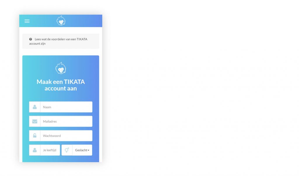
Current website before redesign
The research
Stakeholder interview
To get a good grip on the project and make sure we understand our client’s objectives, we carefully prepared an interview.
Here are some of the questions we asked during the interview:
- What is your goal with this project?
- How will you, personally, define success for this project?
- Who is your user? What is already known about the users?
- In your words, what are the problems we should be trying to solve?
- What changes are coming up on the product roadmap?
- What are the strengths of the current system?
- Have you tried anything to solve this problem before?
- What defines success? What are bad results?
- Who are your competitors?
- Are there any technological limitations?
- Do you have concerns about the process of designing this deliverable? What are some frustrations you’ve had with other design deliverables in the past?
Stakeholder Interview outcomes
The users don’t use the comparator feature
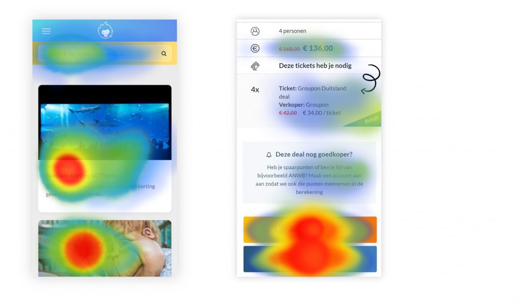
According to heat maps (Hotjar), when the user searches for a deal, most users don’t choose the ‘best deal’ shown in the result. Either the user will choose a ‘less good deal’ or simply drop off after his search. Our client assumes that the users don’t understand the results or don’t trust them. For this reason, he would like to explain the results to the user or to show more options like ‘flight comparator websites’ do.
According to the stakeholder, the user should create an account to have better search results
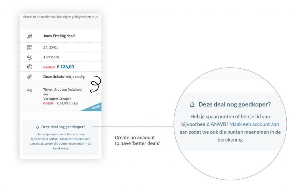
Most of the time, the users can have better deals by filling the points they have on their loyalty cards. Nevertheless, in the current solution, the users have to create an account in order to log these data. However, not many users register. According to our client, they might not understand the benefits of that feature.
The search results have to synthesize a large amount of information
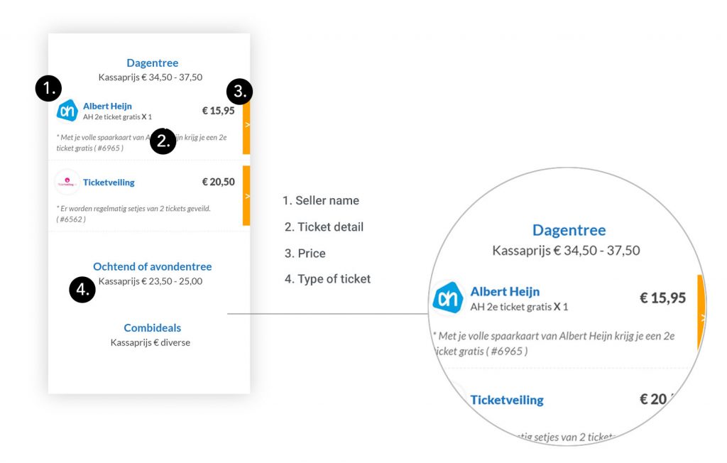
A very large amount of information has to be displayed on the result page of the comparator: seller name, price, points needed, details, type of ticket, validity, etc… Our client was puzzled between showing all these details to the user and optimizing the results for mobile screen devices. We had to find the right balance, in particular, to not overwhelm the user with too much information.
User interview
We wanted to find out the reason why users were dropping off after looking for a deal. This was a good opportunity to test the hypothesis and assumptions generated during our stakeholder interview.
5
User interviews
4
Didn’t notices the search feature at first
1
Only successfully went all the flow
80%
Felt uncomfortable with creating an account
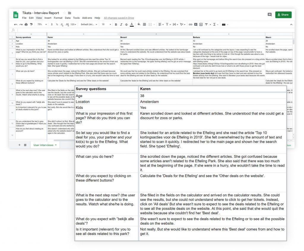
We tested the current site with 5 users and here is an overview of it:
- What is your impression of this first page? What do you think you can do?
- So let’s say you would like to find a deal for you, your partner and your kid(s) to go to the Efteling. What would you do?
- What can you do here?
- What do you expect by clicking on these different buttons?
- What is the next step now?
- What do you expect with ”look at all the deals”?
- Is it relevant for you to see all deals related to this park?
- How do you feel about creating an account?
- Do you trust this website?
- Would you use this website after this test? Why?
User Interviews outcomes
Put the comparator forward
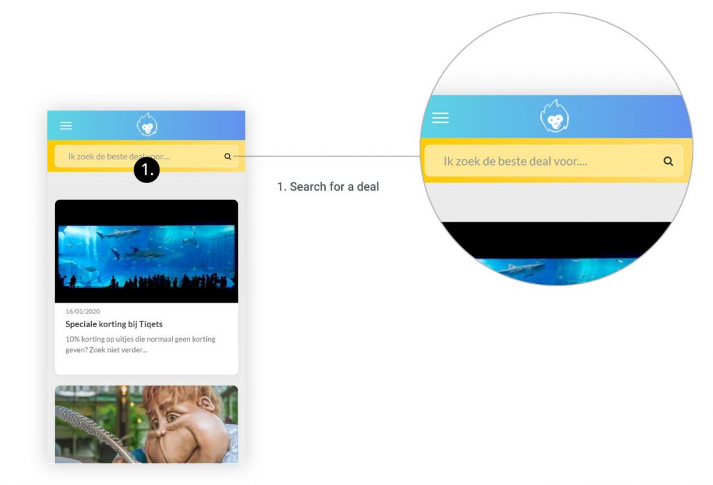
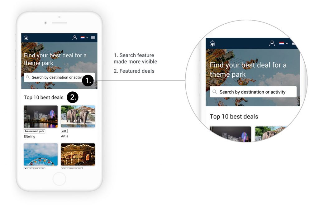
Most users were missing the search feature, selecting instead an article card related to a deal. This confirmed that the search feature isn’t accessible or obvious enough. Generally, the hierarchy over the website could be improved in order to state clearly the purpose of every page.
A clearer copy
Most users got confused by the copy of some buttons. For example, with the button ‘look all deal’ the user isn’t sure if he should expect to see ‘all the deals of the whole website’ or ‘only’ deals related to the park he is looking at.
When several of them are next to each other, they all look primary. We should define a primary action that we expect from them and a secondary, less important, and make it clear through the use of color and copy.
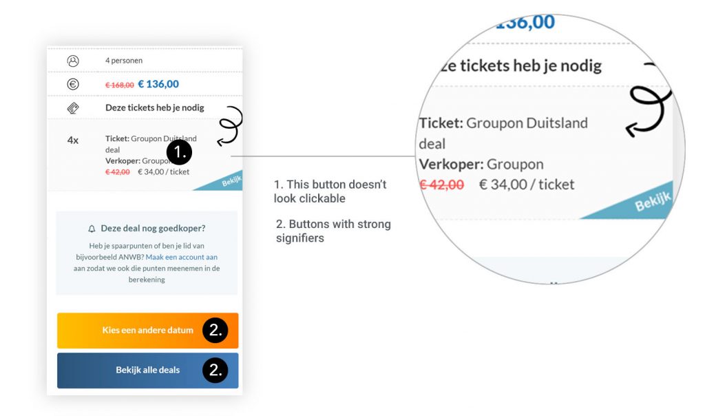
Some buttons don’t look clickable
On the result page, the user is invited to go to a partner website to get his ‘best deal’. However, this link to ‘get the best deal’ doesn’t look like a button. The user will more likely scroll down and click on one of the other buttons ‘choose another date’ or ‘look at all deals’. These buttons have indeed strong signifiers.
Transparent search results
The result page has to explain clearly how the best deal has been found. We have asked our users if they would trust more the results if they could compare the ‘Best deal’ with more results (like on flight comparator websites). Some users expressed that it was more important to them to understand how was the ‘best deal’ calculated more than having the possibility to see all possible results.
Making the account creation optional
Most users felt uncomfortable about creating an account. Most users feared to receive spams by giving their email address. Some of them confessed that if the registration was too complicated or time-consuming, there is a chance they will leave the flow. Consequently, if the account creation is necessary, it should be as painless as possible for the user, and most preferably, optional.
User Persona
Linda, 35 years
“I wouldn’t like to see the price of an activity be an obstacle for having a good family time”.

User Persona
Behavior:
Linda, has two kids, and she likes to go with them and her husband to museums or once in a while to a zoo or theme park. With a family of four persons, costs add up quickly and going out can become expensive. Wherever possible, she tries to make economic choices to not go over budget. That’s why, when it comes to theme parks or zoo, she looks for good deals on the internet.
Pain Points:
- Lack of trust and transparency regarding the Tikata website.
- She doesn’t understand the results she gets on the comparator.
- She often looks for deals at the last minute and she doesn’t have so much time for it.
Motivations:
- She wants to save money
- She would like to be sure she is not missing a good deal
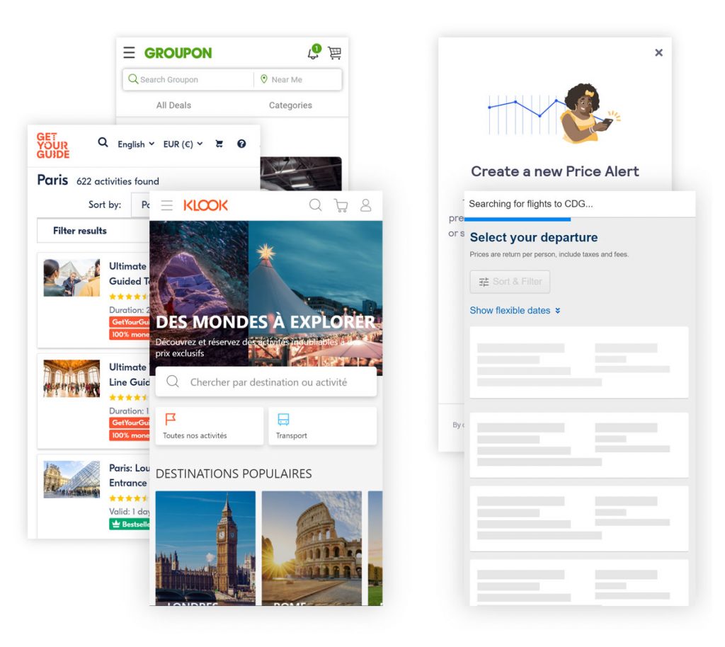
Market Analysis
Finding the best result without creating an account
We compared several similar websites, such as Klook, Groupon, GetYourGuide and several ones providing flight deals. We drew two main conclusions:
- On all the websites, the user can log his data and find the best deal without having to create an account;
- If necessary, the user can optionally create an account in order to receive price updates;
- To show to the user that the comparator is looking through several websites, a loading screen or an animation shows how many websites are looked at.
The solution
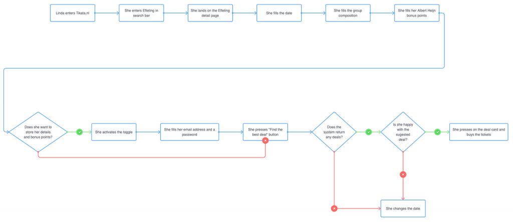
Job to be done & user flow
Jobs to be done helped us to define the main flow of the search feature:
- Finding the best deal
“As a mother of two kids I want to find the best deal to go to the Zoo, because the tickets are generally expensive for a family of four persons. ”
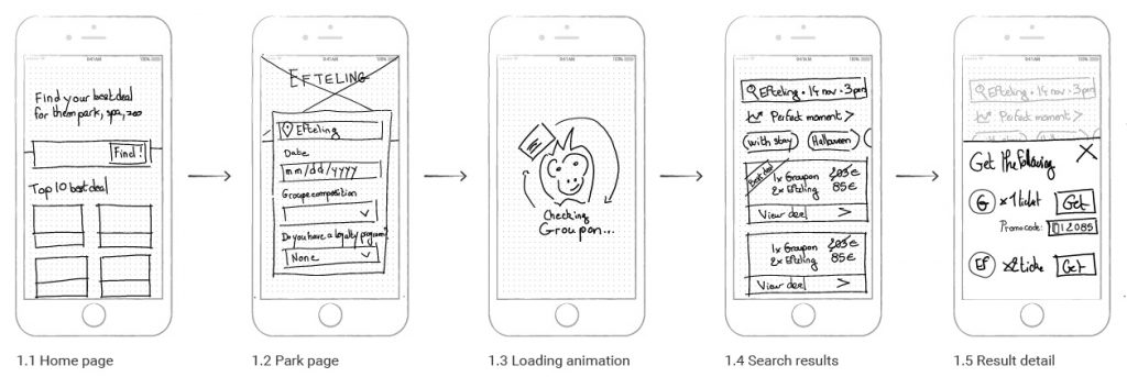
Wireframes
From the user flow, we made different wireframe synthesizing our learnings and find the best hierarchy to present the information architecture of the website for the comparator flow.
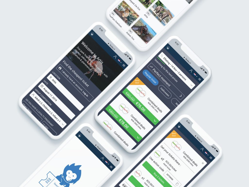
High-Fidelity Prototype
We have developed an animated prototype of the search feature. This prototype facilitated discussion with our client. It also allowed us to get relevant feedback and was improved accordingly.
Video of the high-fidelity prototype
Making it easy to find a deal
The search feature is the first thing the user will see on the homepage, together with a short text explaining the purpose of the website: ‘Find the best deals for amusement park and zoo tickets’’. This makes it easy to understand and use. Below, will be presented by card the ‘10 best deals, the most searched parks, etc…

I remember you
When users start typing, several research suggestions appear. If this isn’t the first time on his website, he will see a recent research history avoiding the user to type the same request.
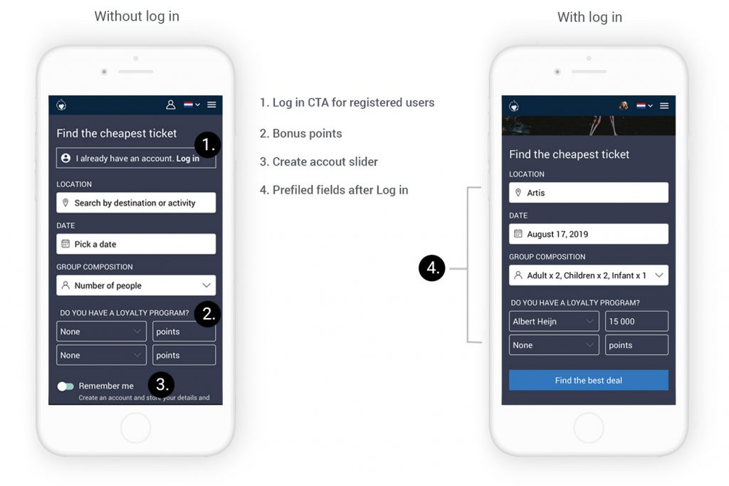
Before filling in all the necessary information, registered users will be prompted to login. If they do so, all the following fields will be pre-filled, avoiding again unnecessary typing.
Get the best deal… without having to registered
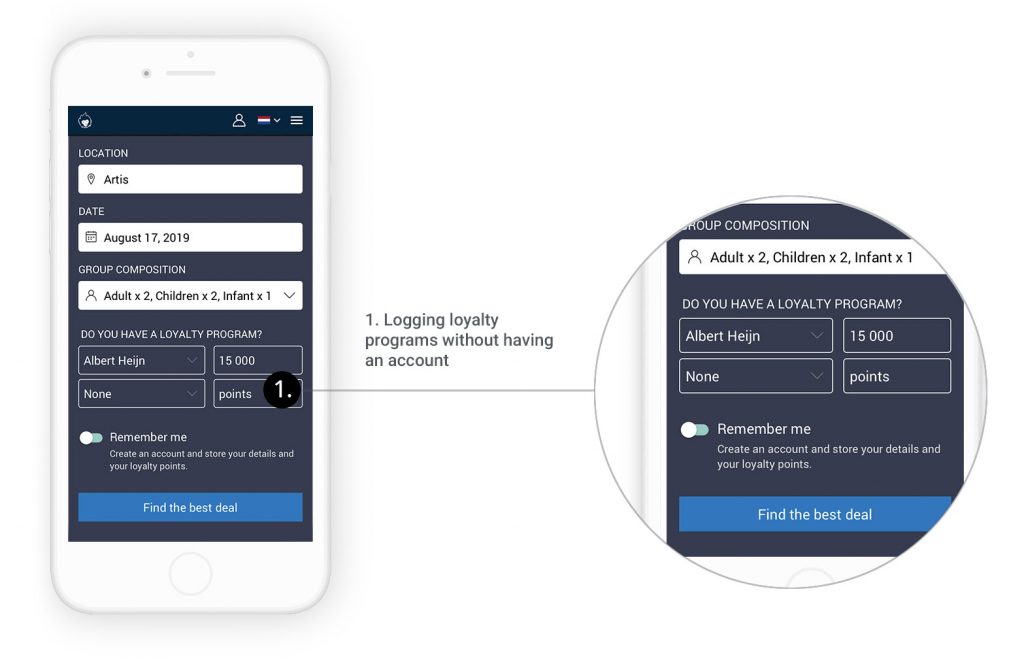
According to our client, the user had to create an account to log all their loyalty programs and get better search results. Nevertheless, after research, it appeared that most users have a maximum two loyalty programs. This makes it possible to ask them to log them in during their search without creating an account. If they want to not have to enter them again in the future, it is possible for them to create an account and save them. But this is optional. In that case, the value proposition of creating an account is clear: if they plan using this website again, creating an account will avoid redundant typing.
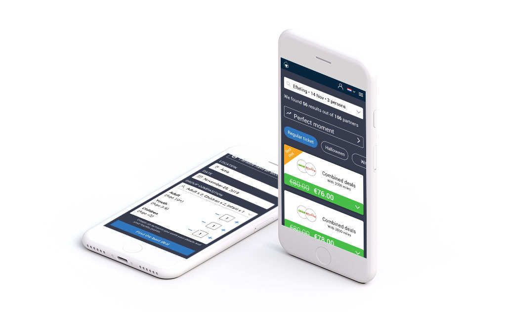
Reducing the number of fields with filters
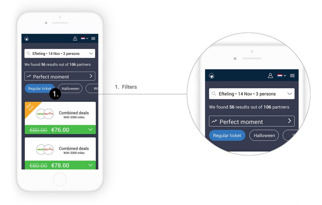
At first, our client wanted to add more fields for the user to specify what ‘type’ of tickets he would like. For example, for a spa, you can have a ‘day ticket’ an ‘evening ticket’ or even a ‘ticket with stay’. Instead of adding more fields to fill in in the previous step, we proposed to add filter in the search results. By doing so, the user can also compare different tickets without having to start his search over again.
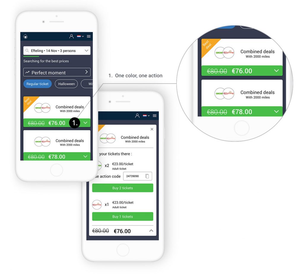
One color, one action
In the previous version of the website, most users didn’t know what to do after getting the search results. We decided to have one call to action button of the same color at every step to indicate clearly what the user has to do. The rest of the card, is black and white, reducing the cognitive load and making each step very clear.
Iterations
First iteration
We focused our efforts on the comparator search and results. We decided to show only the 5 best deals on the result page with the possibility to load more of them.
Feedbacks:
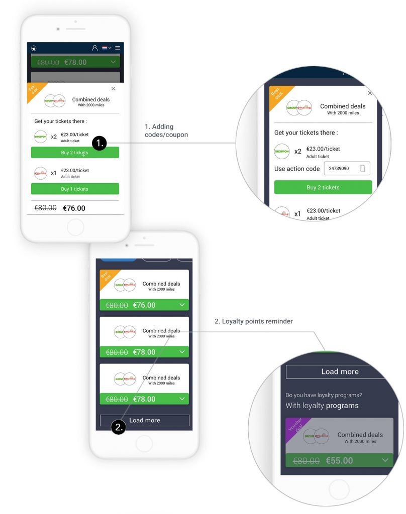
- Explaining to the user he can get better results by login his loyalty points in the result page;
- Adding codes/coupon fields on the deal details.
Second iteration
We added price suggestions on the calendar to show to the user which day of the month is the cheapest. We designed further the comparator results, and in particular the deal detail explaining to the user how to get his deal on the partner’s websites. As requested by our client, we added a card on the result page explaining to the user that he can still get a better deal if he has vouchers.
Feedbacks:
- Add more space in the deal cards for a description of the ticket;
- Adding administration costs in some cases;
- The CTA ‘Best moment’ should be placed at the end of the page;
- Our client would like to add blog articles on the park page.
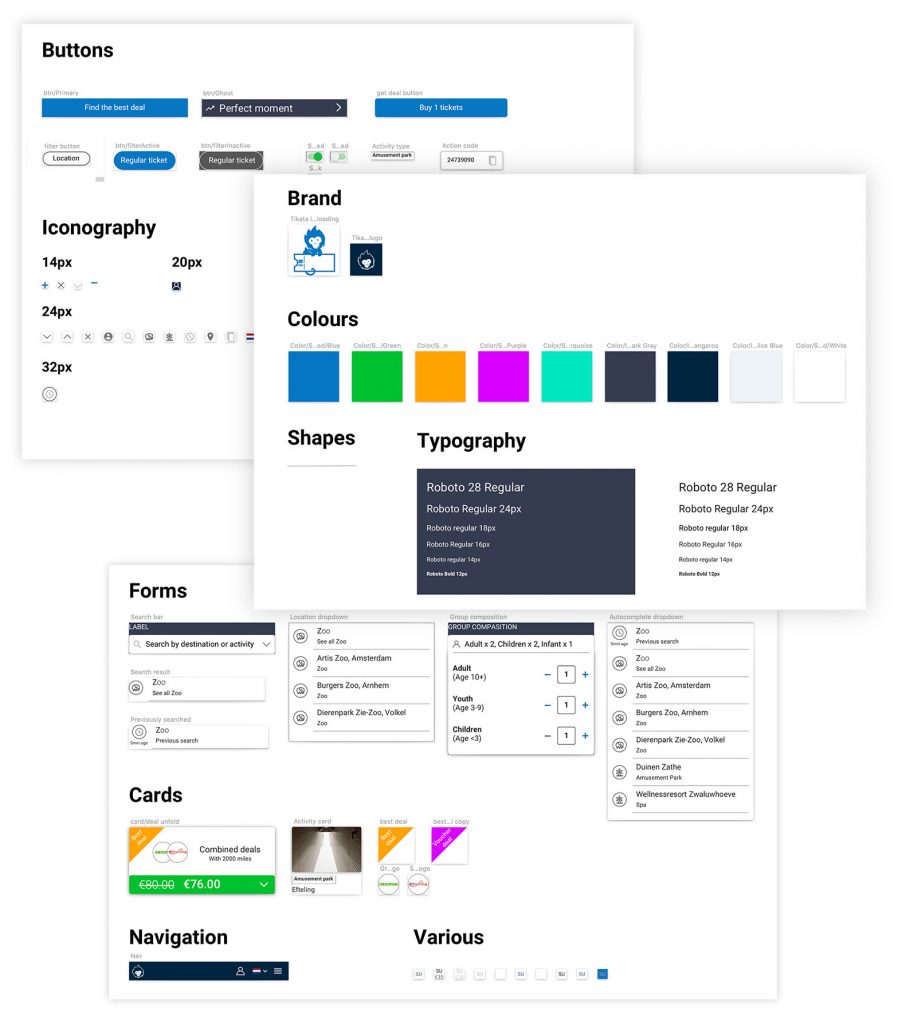
Style guide
Ensuring the continuity
To ensure the continuity of our work, we have created a style guide. In this way, the UI Designer will only have to edit these styles and symbols to develop the new Tikata interface.
Conclusion
Our client was very satisfied with the end product. We believe that the changes we brought to his website can largely increase the conversion. We hope that by looking at the data from the new design, we will be able to appreciate it in the future. We organized our documents and send them to a UI designer who will integrate the flow we designed in a larger redesign of the website.
Next Steps
- Following up and supervising the interface design with the UI designer
- User feedback on the new redesign
Learnings
- Understanding the objective of the business
- Compromise between user needs and business objectives. It is not about imposing the user-centered approach to the business but finding a middle way.