Project Overview
Study project at Iron Hack – Designing a microsite for the Dekmantel, one of the largest European electronic music festivals.
Introduction
Designing a microsite for an electro festival.
The Dekmantel is a five-day electronic music festival taking place in Amsterdam. The festival has two main locations in the city: Amsterdamse Bos (The Amsterdam Forest) and Aan ‘t Ij (around the Ij river in the city center). Every summer, the festival delights electro fans who come to see world-renowned Dj’s, as well as a huge list of rising names. In recent years, the festival is trying to reach a wider audience by celebrating the richness of Electronic music from electro, acid, techno, trance to jazz music. The Dekmantel expanded to five days and host next to its Dj performances conferences and talks. The objective of this microsite is to create a compelling experience before, during and after the event, to engage the customers and attract new ones.
Objective
The ambition of this project is to launch a microsite for the 2020 edition of the event.
Challenges
Create a compelling experience for the user, throughout the event.
The objective of this microsite is to create a compelling experience before, during and after the event, to engage the customers and attract new ones.
This involved several research questions:
- What problems are the users facing with the current website?
- What information should be displayed and at what time?
- How can we keep customers engaged and attract new ones?
- Which graphic identity would appeal to that audience?

My role
I led the design of the microsite independently covering a series of roles to make sure to deliver a high-quality project. These roles included:
- UX strategy
- Market & trend research
- User research
- Interaction design
- Motion designer
- UI development
- Usability testing
- Desirability testing
Key deliverables
A number of deliverables were required for the project, including:
- An advanced prototype of the website
- Responsive
- Life cycle (states of design)
- Marketing presentation
- Documentation for dev hand-off (Zeplin)
- Report as a Medium article
Scope & constraint
For this project, I have focused on the last three days of the festival taking place in Amsterdamse Bos. This festival in the forest of Amsterdam has 7 stages featuring more than 120 artists.
The research
Very early in the process, I did user interviews to get a better understanding of the problem and test some design directions.
The existing website
An overwhelming layout
The existing website has a strong visual identity and is very rich in information. To see if that is a problem with the target audience, I conducted user interviews with five electro music lovers. I have shown them the current website and asked them their opinion on the website.
- Two of them enjoyed at first the graphic quality of the websites
- All of them felt quite overwhelmed by the amount of text displayed on top of a multicolor moving background.
- One of them wished to have the possibility to see more images or videos giving him a preview of the atmosphere of the festival.
- They all found it hard to go through the artist line up and recognize artists they would be interested in.
This short research helped me to discover some pain points and to frame the questions a survey I have developed later in my process.

Trend research
A website as an interactive flyer: eye-catching, engaging and informative
I did a quick trend analysis of the event microsites, in order to find the one that would best suit my target group. I could distinguish three types of event microsites:
- The flyer: one scrollable page, very rich in multimedia with a large hero image, photos, video, and even parallax.
- The homepages: the main page introducing the event from where the user can get to different areas of the site with a hierarchy and navigation structure.
The blog: very rich in information and regularly updated.
I have then presented to the interviewees one example of each type of event website. They were generally very impressed by the ‘flyer type’ website because of its very visual aspect, producing the ‘wow-effect’ I was looking for. One of them stressed the importance of a good site hierarchy in order to find efficiently the content he would be looking for during the festival. For example, he wanted to be able to compare on the go the timetable of the different stages to decide which artist he will be seeing next.
The survey
Information architecture and mood user research
The surveys helped me to understand the needs of festivalgoers and to find an information architecture relevant to my target group. It was also an opportunity to test some colors and mood boards with the user. Among other things, I asked the following questions:
Questions:
- For what reason would you go or not to the Dekmantel Festival?
- What information are you looking for before, during and after the festival?
- What do you think about the current website?
- According to you, which of the following colors and moods would fit the best for an electro festival?
5
Interviews
55
Survey answers
1/3
Find the current website is ‘bad’ to ‘very bad’
67%
Goes to the Dekmantel because of the line-up
Take away
From my survey, I could get a better understanding of the problem and test some design directions.
Layout
Improving the readability of the current website
Although the site is visually interesting, many users described it as “difficult to read” because of “too much visual information” and its moving background. The new website should always look attractive, but without compromising its readability.
“Bad readability”
“The letters are too small and difficult to read, hurts my eyes”
“There is too much visual information.”
“This webpage looks confusing”
“The color of the font with the background does not make it easy to read”
“I don’t like the combination of colors.”
“A bit hard to read the artists, tiring for the eyes”
“A bit too busy”
“The ‘trippy’ background with the text on top is awful.”
“I have decided to check their social media instead.”
“I can’t read without straining.”
“The design is distracting and annoying for reading.”
Timeline
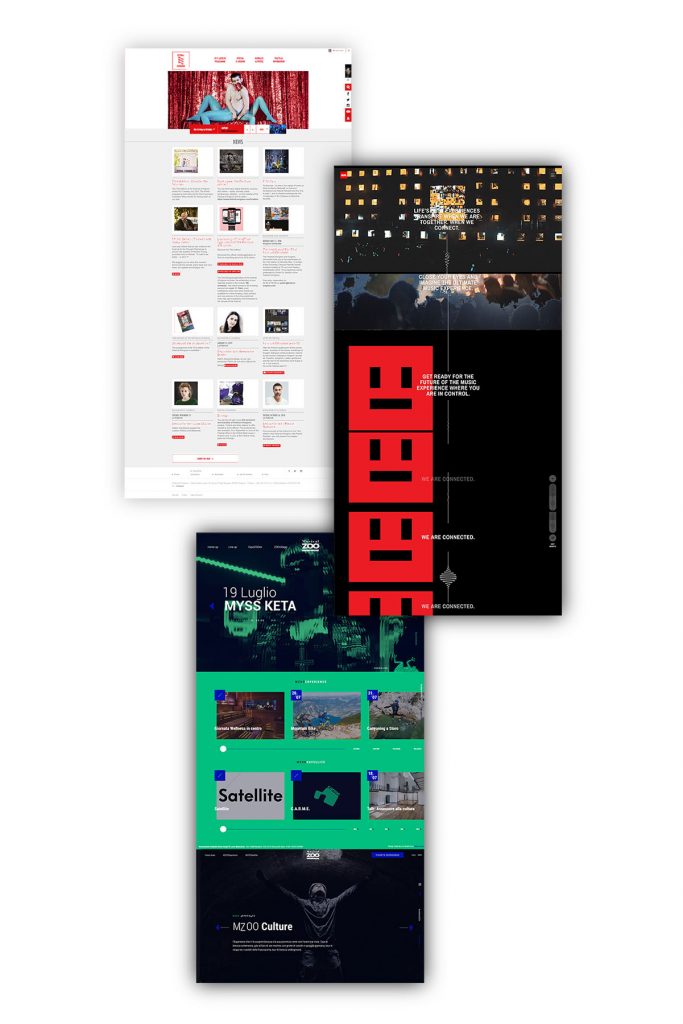
Displaying the right information at the right time
For the user the most important information to find on the website are:
- Before the event: date and time, artists line up and ticket price
- During the event: Map of the location, timetable, artist line up
- After the event: Pictures and videos, artists who played during the past edition
This gives me very useful information about the information architecture of the website during the three stages of the event. I took this research further with a live card sorting with different users.
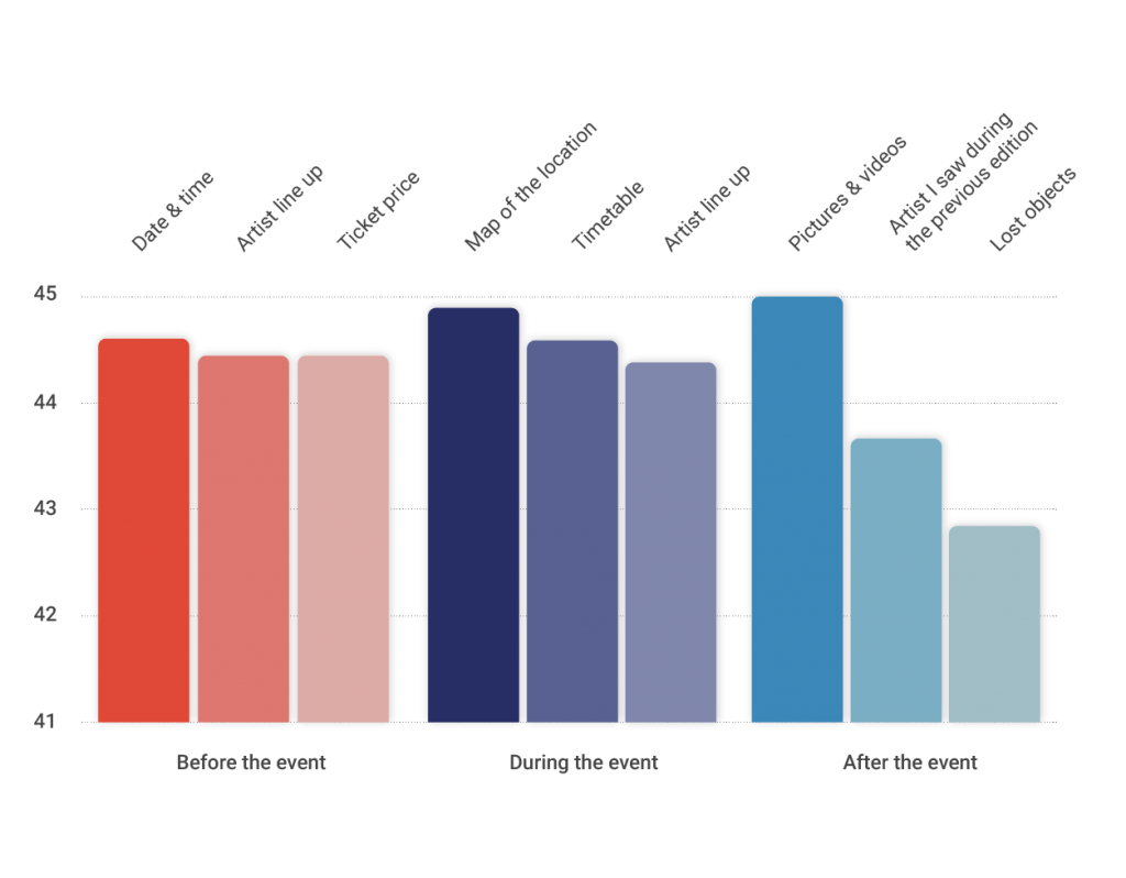
Colors
Researching the user group’s preferences
In my survey, I have asked the participant to vote between different color sets and mood boards. The colors were presented first to the interviewees and the mood boards afterward.
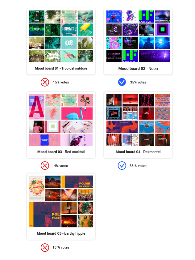
Mood boards
The current colors and mood of the website are fine for most users
The current colors and mood of the current festival don’t really seem to be an issue. They arrived consecutively second in the votes. Even though there was not a clear majority of votes for any other proposed moods. For that reason, I have decided to keep the same colors for my design and I have mainly focused on improving the information architecture of the website (before, during, after).
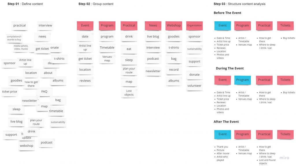
Information architecture
A simplified structure: Event, Program, Practical and Tickets.
I ran a card sorting experiment with four different persons. From there came up the following structure:
- Event: the landing page of the micro-website. This page should introduce the event in a very attractive way and invite the user to know more about it and buy tickets.
- Program: this section should showcase the event program, the artists, stages and times.
- Practical: here, the user can get all the practical information about the event such as the event location, transit information on where to stay during the event.
- Tickets: this is where the user can buy a ticket for the event.
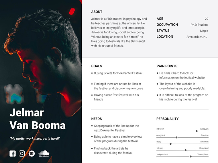
User Persona
According to my research, my user character is more likely a 20-30 year old who likes to go to summer festivals. I choose to focus on undecided festival-goers, who love electronic music, without being aficionados themselves. They would most likely go there to have a good time with their friends.
The Solution
Mid-fidelity wireframes
After shaping the information architecture in sketches, I designed medium-fidelity wireframes. These screens were used for in-person testing, which allowed me to improve functionality and eliminate user pain points.
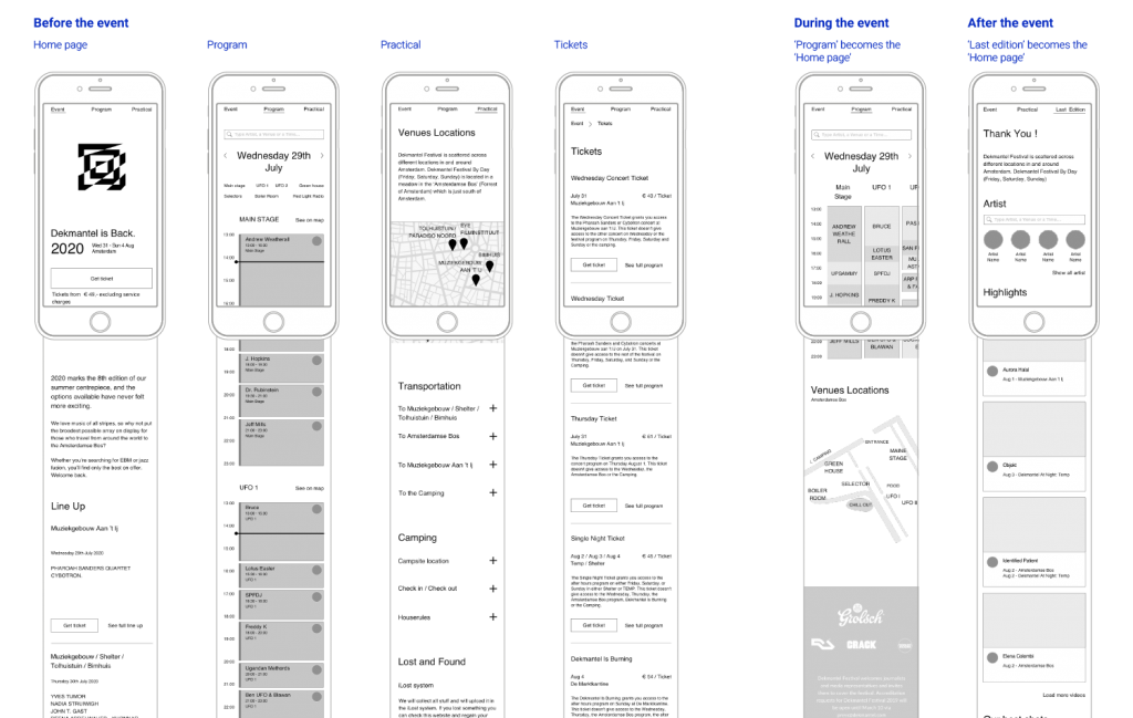
Displaying the right information at the right time.
According to the survey, the user will be looking at different information during the different stages of the event. This will have an impact on the information architecture of the website.
- Before the event: The event page will display the main information about the event such as location, line up, date, practical information, and call to action for buying the tickets.
- During the event: The landing page will become the “program” section. In that way, the user can easily access the program and know where to go during the event.
- After the event: the event page will display a thank you message with pictures, videos, and the lineup of the artist of the previous edition. In that way, the user can easily find back the artist he has discovered. At the end of the page, the user is invited to subscribe to the newsletter in order to stay engaged.
High-fidelity prototype
The home page
For the high-fidelity prototype, I reused the color palette of the current website: red, blue, and white. I replaced a large amount of text with images to show the main information about the event. I spiced up the rest with motion and parallax effects to impress and engage the users on their first visit.
The diagonal lines and geometric shapes recall the existing graphic identity of the website.
Program page
On the program page, I reintroduced horizontal scrolling for the timetable. I understood during interviews with users that this makes it easier to see which artists are playing at the same time. As there are quite a lot of artists and stages, a filter can help the user to refine his search.
Ticket page
I’ve simplified the ticket section by creating “cards”. At first glance, you can see what is included or not included in these tickets and compare them easily by swapping right or left.
The stages of the event
During the three stages of the event, the landing page will change in order to display the most relevant content for the user before, during and after the event.
Before:
Event introduction as landing page
During:
The ‘program page’ as landing page
After:
‘Thank you’ page as landing page
Usability testing
Remote testing
Because of a very limited time frame, I used Maze to do remote user testing. In order to target my audience, I have distributed my prototype through the Facebook group of the festival and some other electro-music groups. In total 51 people tested my prototype.
Feedbacks:
- Learning about the event, finding the program and buying a ticket did not present any difficulties to the user;
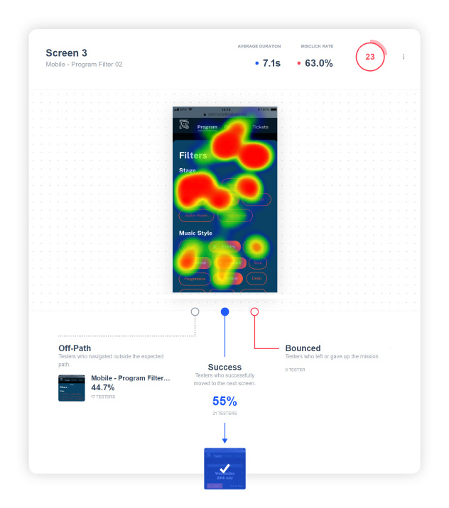
- Some users couldn’t find the action to close the filter panel;
- Some users thought that the event page was too long to scroll;
- Colors are always subject to debate. But this result was predictable according to the survey I did in my research phase.
Desirability testing
An improvement compared to the existing design
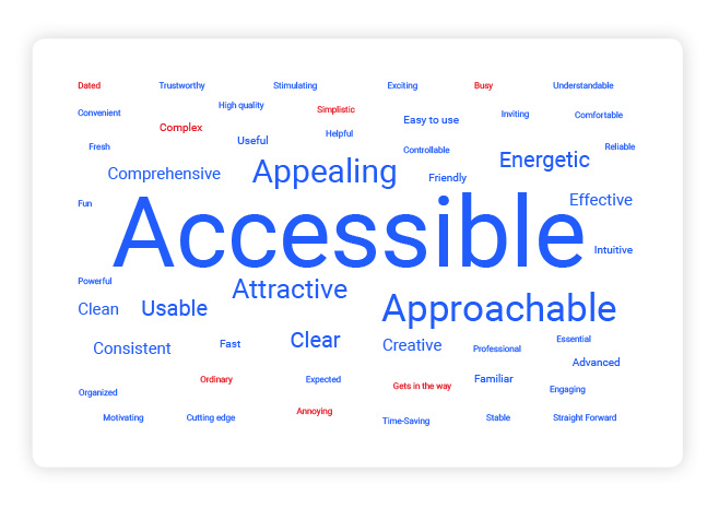
In the usability testing, I asked the user to select a few words from the Microsoft desirability testing list. In general terms like “Accessible”, “Appealing”, “Energetic” and “Usable” qualified the design. It is certainly an improvement from the existing design, qualified as “confusing” and” illegible” by some users.
Future iterations
There is no user feedback without iterations! Here is a shortlist of my intended change for the website:
- Making the home page more compact by reducing some spacing, shortening the program section;
- Developing the “Practical “page;
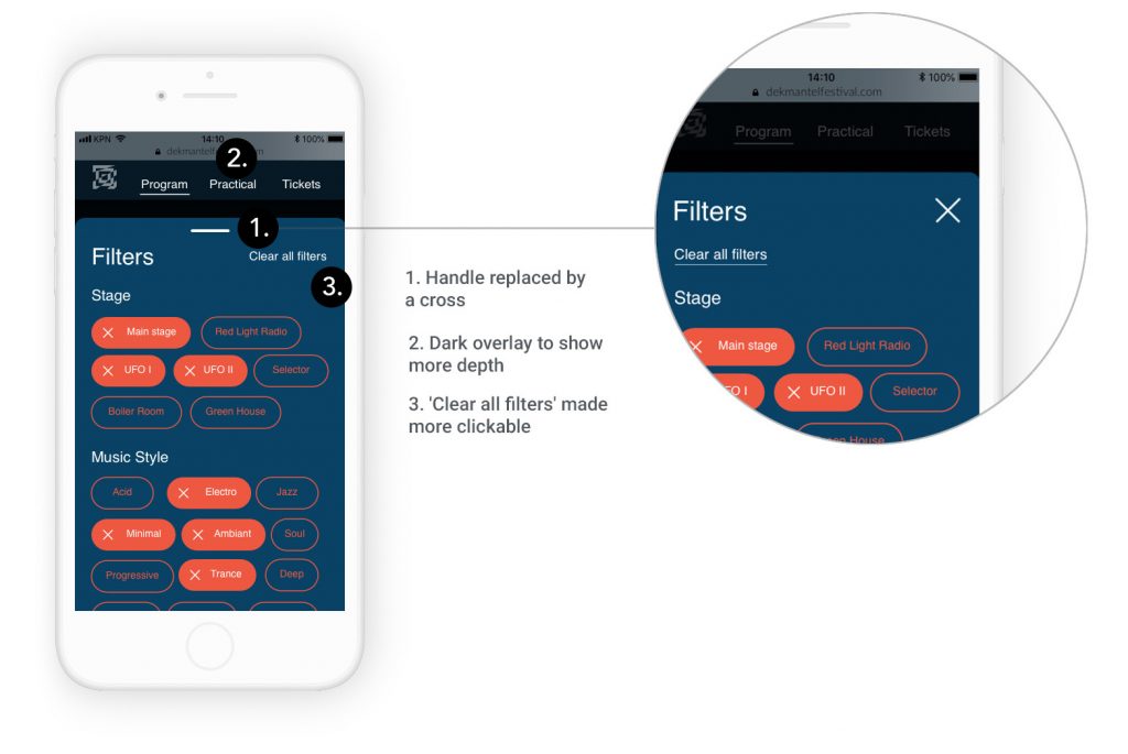
- Making the closing action of the filter panel more obvious with more spacing from the headers, a stronger shadow or with a black overlay below the panel.
Conclusion
This project was a great challenge to produce a qualitative product in a very limited amount of time. Because of its promotional function, the microsite needed to be very appealing. Nevertheless, for such a project I needed to spend my time wisely. In my opinion, user research is the real value of the UX/UI design and I did not want to leave it out for saving time for the UI. Thanks to short user interviews I could quickly find out the pains of the current website. With a design focus survey, I could validate some design options and create quickly the information architecture of my website. Finally, with remote user testing, I managed to test my product with a pretty wide amount of people. I would nuance that quantitative results will never bring the context of a very valuable in-person interview. But it allowed me to validate ideas and make quick design decisions.
Learnings
- Testing an existing design on the early stage of a project gives a very quick design direction
- Time is not an excuse for skipping user research. The combination of user interviews followed with a design-oriented survey can save a lot of time.
- Mood board testing does not guarantee that the design will appeal to all users. But it is a good way to validate or not the design options.
- For desirability testing, I have noticed that the order of words of the list matters. A lot of users didn’t bother to go to the end of that long list. Since the words were in alphabetical order, I assume it is the reason why the word “Accessible” received way more votes than the words “Easy to use”.